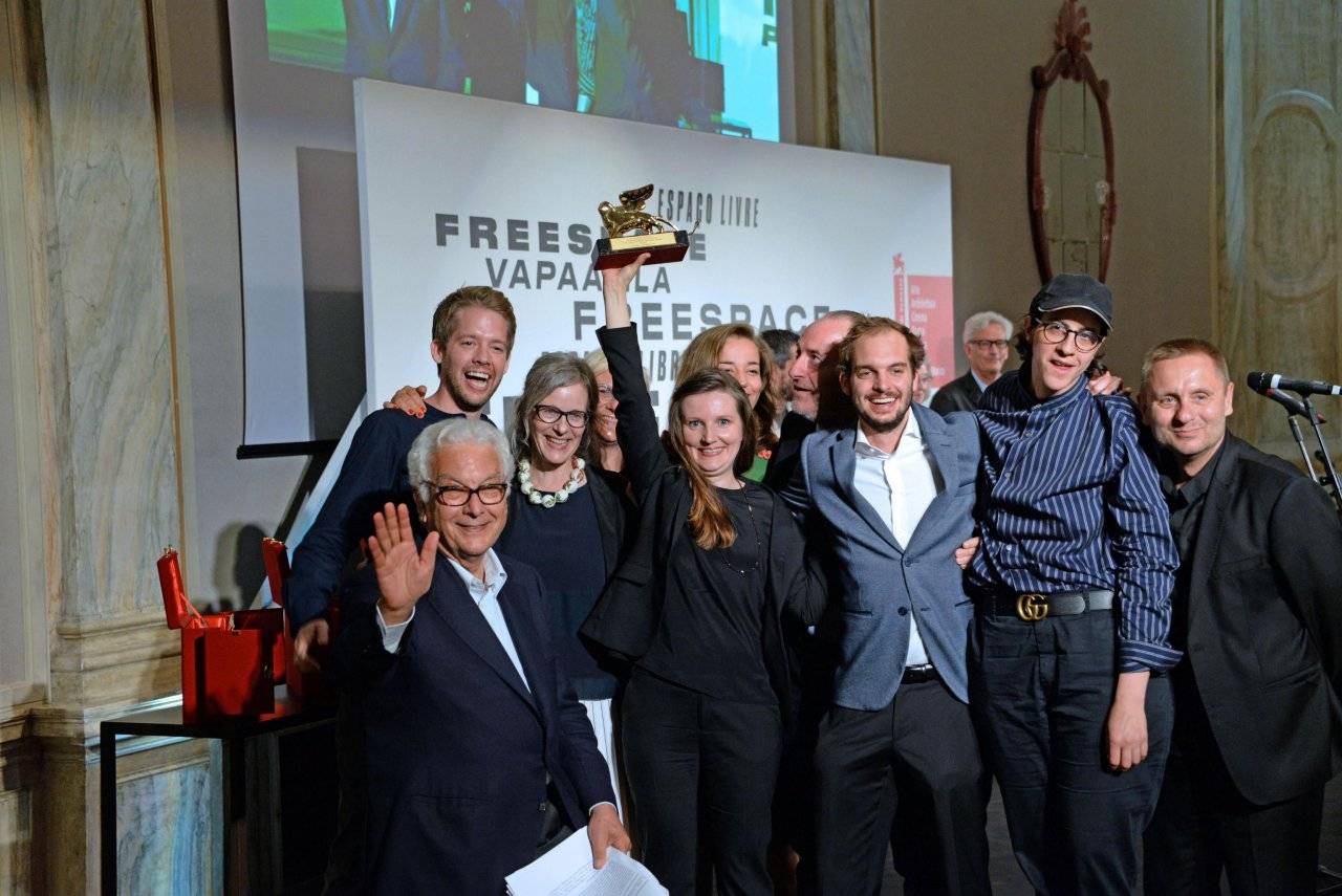
The SWISS PAVILION this year came out on top winning the Golden Lion for best Pavillion. The pavilion has been widely talk about for its simplicity, yet cleve design which the Swiss President, Alain Berset, described as “it attempts to hold on for a moment to the constantly vanishing boundary between the private and the public,”.
The pavilion is titled HOUSE TOUR: 240. The 240 in the pavilion’s title refers to 240cm, which is considered the optimal height for a living room.
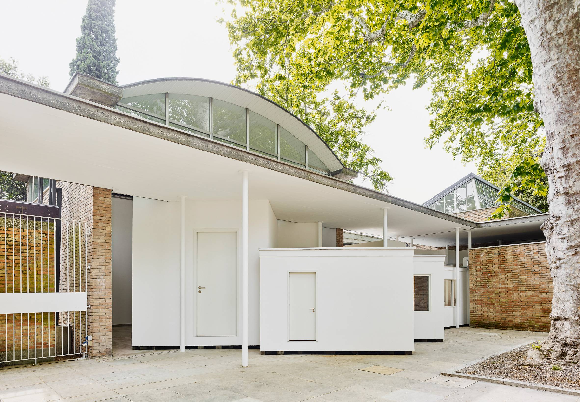
Alessandro Bosshard, with a team of Zurich-based architects Li Tavor, Matthew van der Ploeg and Ani Vihervaara, were responsible for this result this year. They wanted to bring what they considered to be a topic that was taken for granted more often than it should be to the public discussion- the standardised design of todays housing.
They decided that the question of constantly renting and moving in Switzerland was the cause of the constant stereotypical, clinical white movement of design. People want to have a rental home, which is easy to make their own and so therefore the design of the switches, white counter tops and walls has become stubbornly generic.
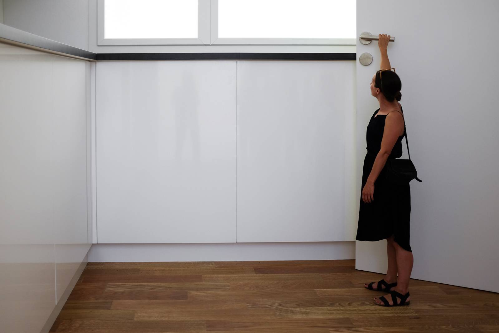
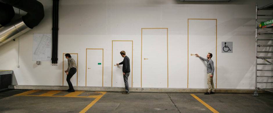
The architects decided to bring this to the forefront of our discussions by creating a home which at first glance seems like every other one, but as you walk around you notice that the perspectives are all wrong. An Alice and Wonderland house. Where certain rooms are only fit for giants and others are a squeeze for the slightest of visitors.
This game of perception is a simple technique to make us pay more attention to basic features, such as door handles, counter tops and light switches. They wanted to highlight the architecture which has become our surroundings, almost like the blank canvas which we have become immune to seeing.
This year’s biennale is directed by the co-founders of Irish practice Grafton Architects, Yvonne Farrell and Shelley McNamara. The two chose the title Freespace as the overarching theme for the event.
They also introduced a manifesto for the biennale”generosity in spirit” in architects’ approach to designing. This can be anything from the creation of a public space within a project or paying particular to attention to smaller details, such as lighting or seating areas.
The Swiss Pavillion stated “We try to find the generosity in the most stubborn condition of the interior or housing and to find qualities by playing with the small elements.”
Watch this space for more updates on the Biennale and where to visit for guided tours and special events.


